Design System Toolkit
Project overview
I created this design system as a self-directed project to accelerate future work and to demonstrate my ability to leverage Figma’s evolving capabilities, including semantic variables for color and mode switching. In past roles, I’ve supported companies in establishing design systems by facilitating workshops with stakeholders and collaborating closely with developers to enhance and integrate components. This project highlights both my approach to building scalable systems and my proficiency in applying modern Figma features.
Variables
Number variables for consistent spacing and corner radius
Color variables primitive & semantic collections
Light & dark mode
WCAG compliant color palette
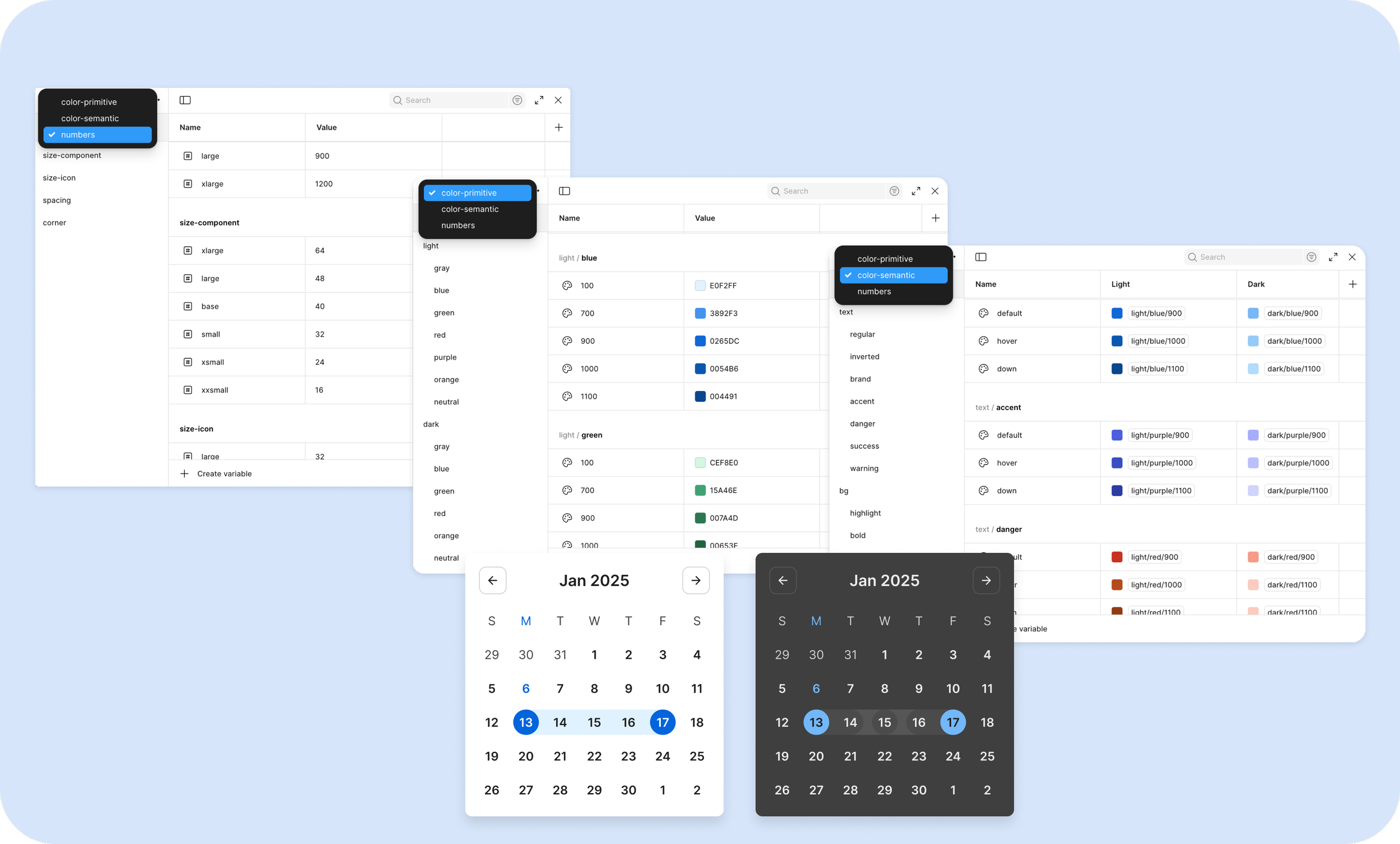
Semantic colors and values are defined as tokens using Figma Variables, ensuring consistency across designs and alignment with developer implementation.
Optimized for Customization
Every component and style has been optimized for fast, easy customization.
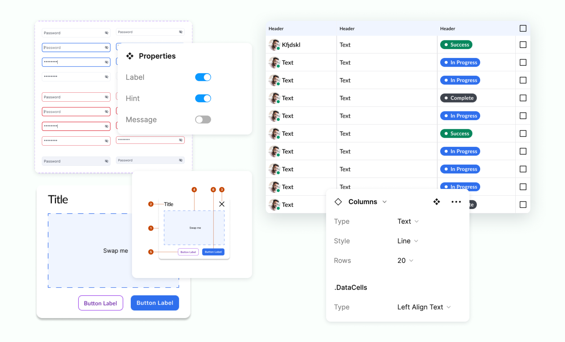
Table component
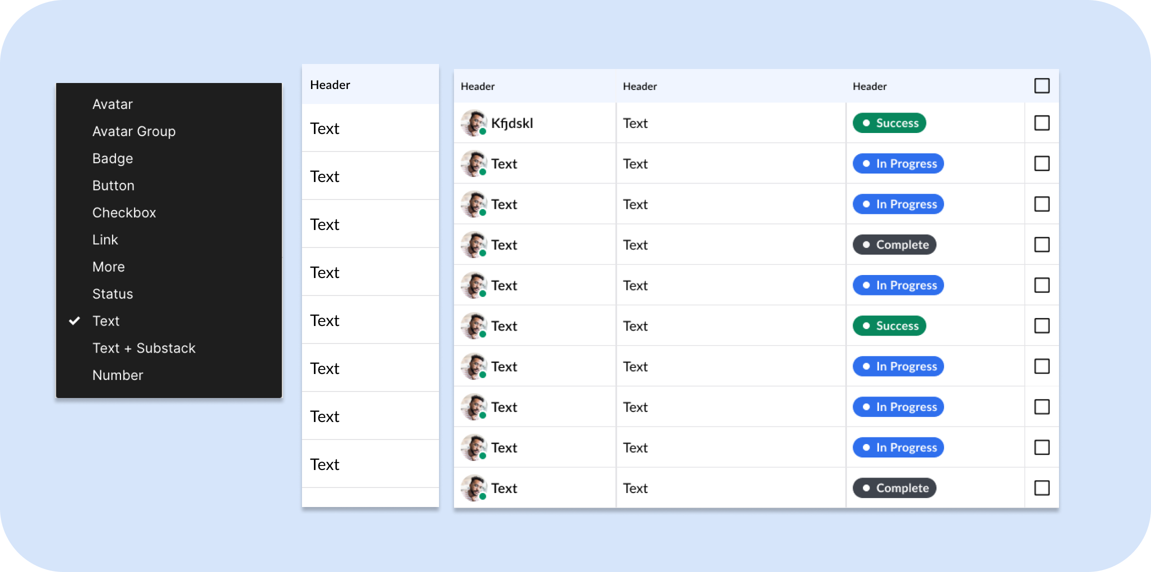
Assemble a robust table with columns designed with atoms.
Table demo 2 min.
Drop down
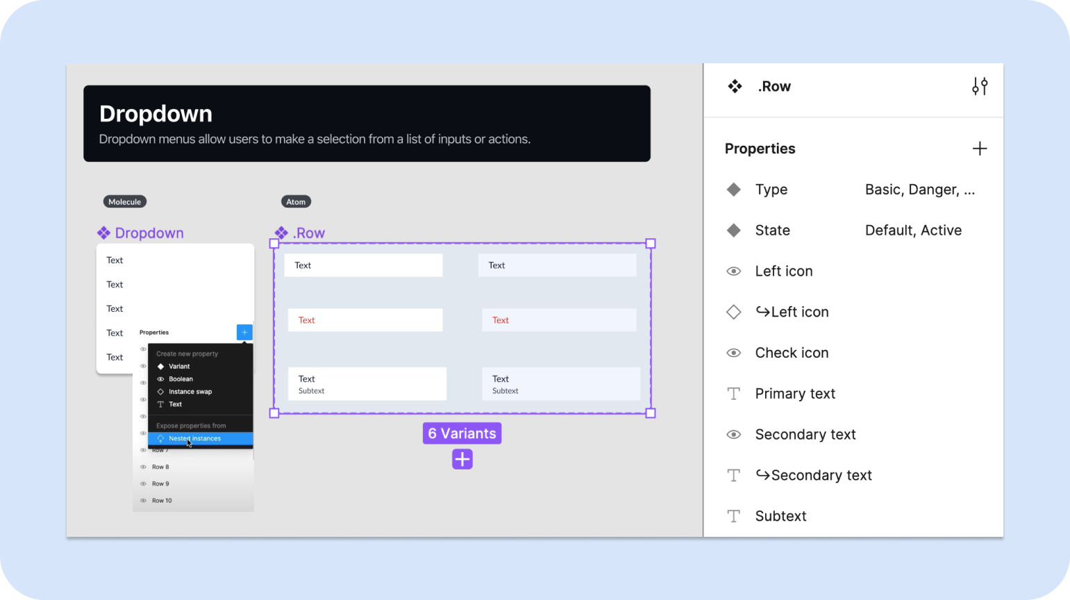
Built with atoms and variants, the drop down can be customized at the row level.
Drop down demo 1:36 min.
Dialog
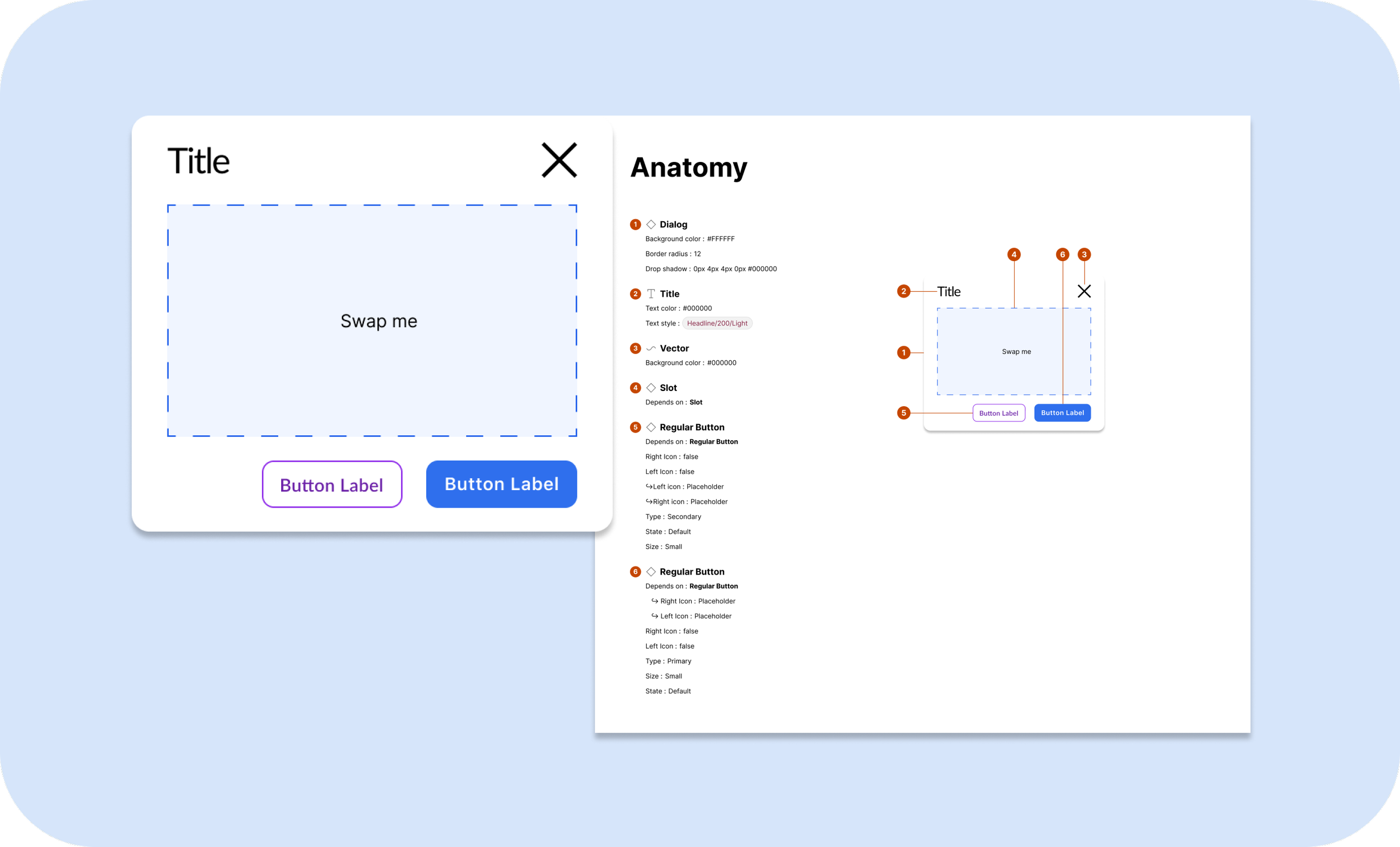
The content of the dialog can be swapped commonly used patterns with slots.
Dialog demo 34 sec.
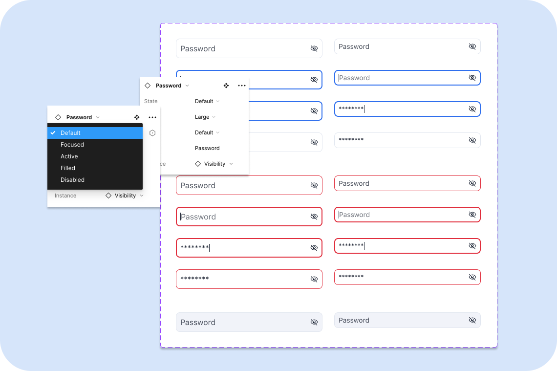
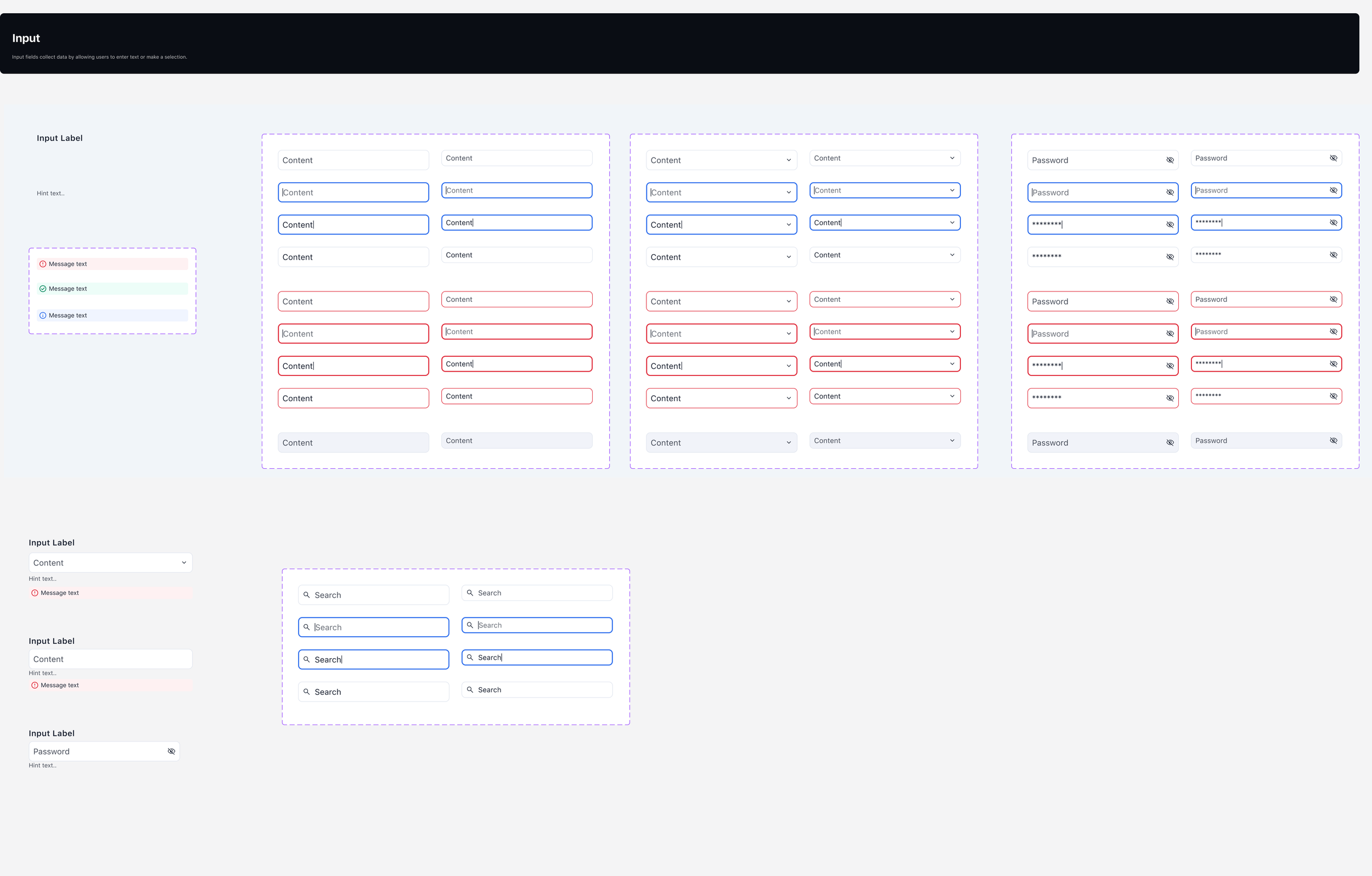
Inputs
Next: First American Notary Scheduler
← Back