
Tyler Courts Online Resolution
Transforming a legacy desktop website into a responsive mobile application for a government agency. The end result was a user-friendly mobile application that increased mobile payments by 23%.
Project overview
Tyler Courts is an online application that allows citizens to resolve traffic infractions The project was focused on web and mobile.
TC wanted to reduce phone calls to the courts, make the process less intimidating to citizens, and improve the mobile experience.
The project was completed in approximately 12 weeks, and I worked with a cross-functional team of Product and Development Managers and Developers.
Users and Audience
While there was not in-depth information on existing personas, it was assumed that the there could be a broad range of ages and cultures.
The language had to be consumable based on a 7th-8th grade reading level.
The product is for people of driving age 16 years and older. The product is used by local governments across multiple states in the U.S.
Design goal
Design a better way for citizens to pay tickets and book court dates
Reduce calls to customer service
Increase mobile payments
Update look and feel to align with Tyler brand


Roles and responsibilities
I was the lead designer tasked with redesigning the UI and trouble shooting the UX. I joined the team after the concept had hardened.
The product owners (2) were subject matter experts, and the architects of the workflow logic and decision tree, and the gateway to the customers. Other engineers and managers were part of the feedback loop.
The team was largely distributed and worked in a remote capacity with weekly design reviews and later, developer demos.
The project was completed in approximately 12 weeks.
I worked with a cross-functional team of Product Development Managers and Developers.
What I did
Lead UX designer
Iterate low-to-high fidelity mock ups
Notetaker on research
Created concepts using Sketch, Axure
Process
I followed the human centered design process
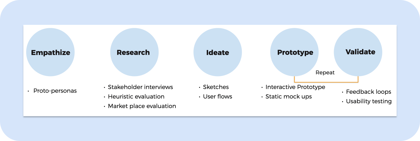
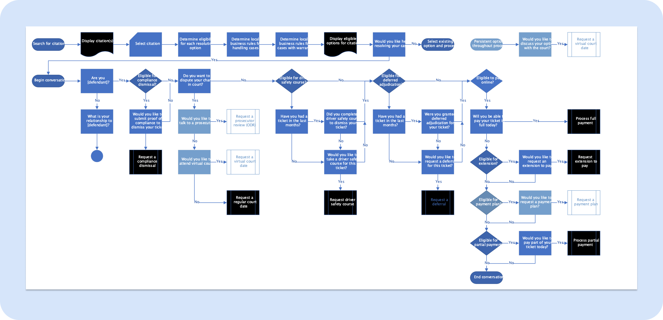
First, the stakeholders provided me with a flow chart and I used this as a blueprint.
Proto-personas
While there was not in-depth information on existing personas, it was assumed that the there could be a broad range of ages and cultures. The language had to be consumable based on a perceived 7th-8th grade level.
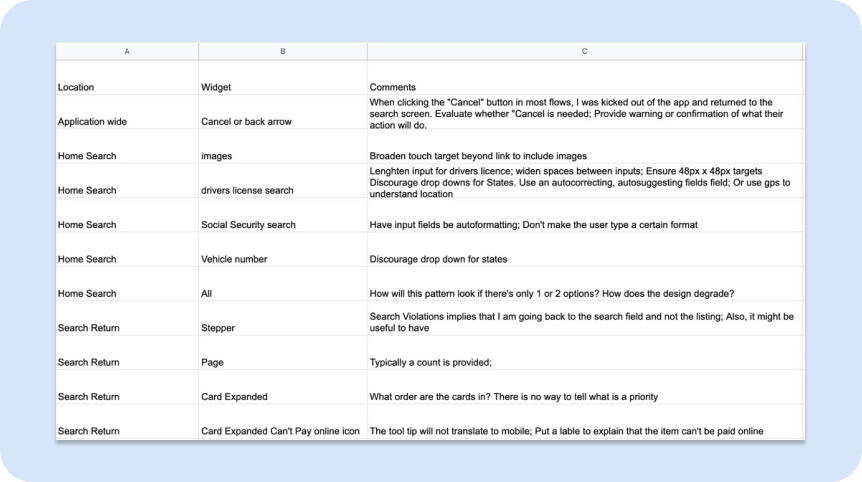
Research - Heuristic Evaluation and Market Analysis
I did a heuristic evaluation of the application and documented issues with the UI. I looked at applications that used a wizard pattern to guide the customer through the process.
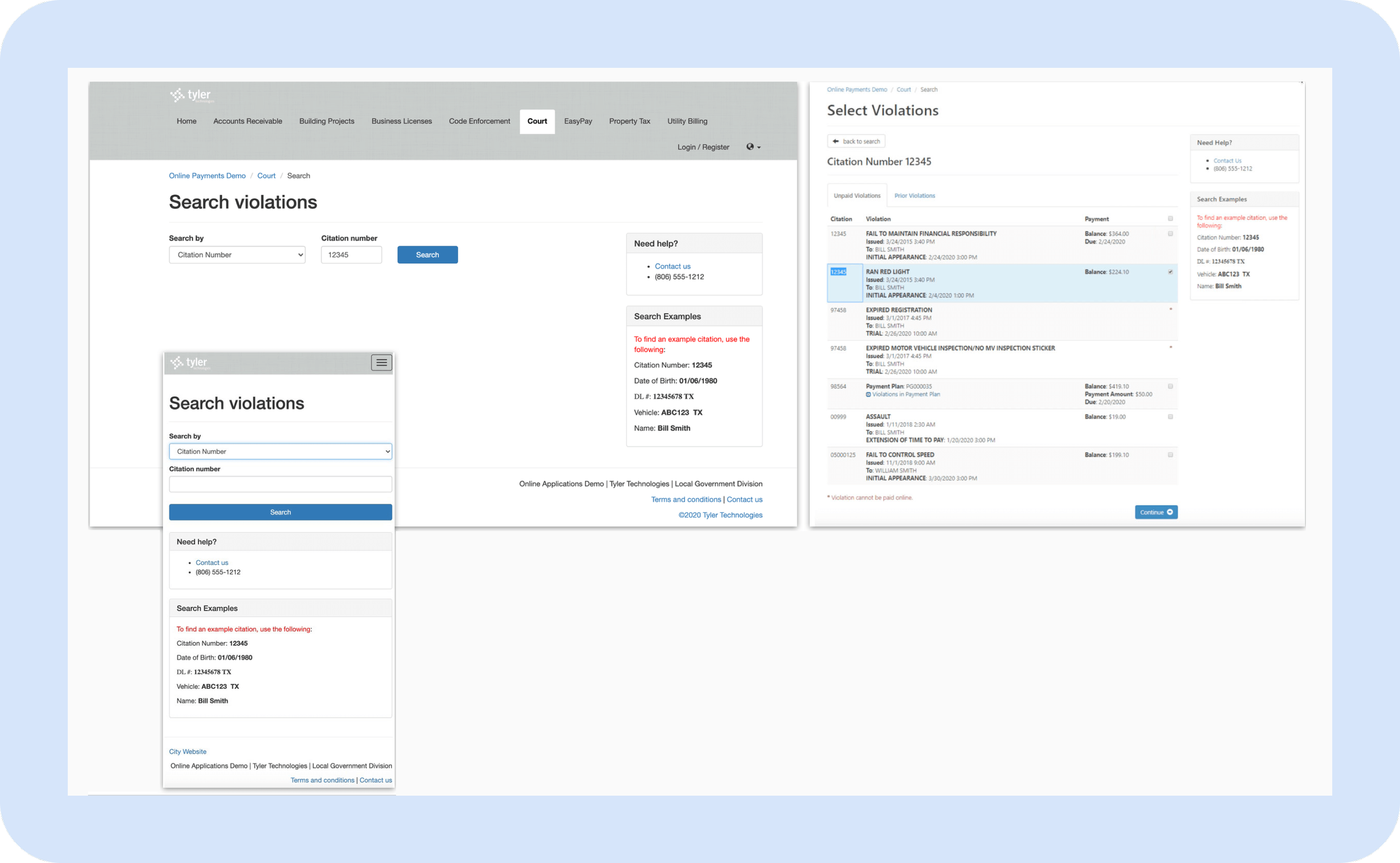
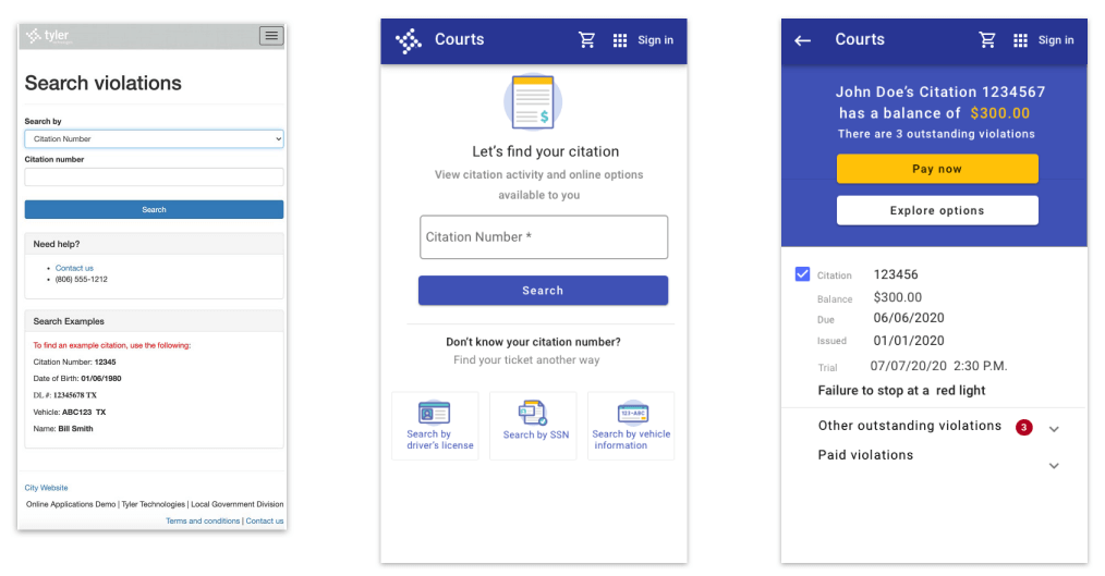
Legacy UI-op Search was executed by a long drop down. Violations were lumped together without any hierarchy or urgency.
Ideation
I used a combination of tools. I used Axure for an interactive prototype that would clearly respond to the different select choices in the decision tree. I used Sketch for static mocks.
I utilized the Tyler Design System, which is based on Google Material Design.
Project challenges
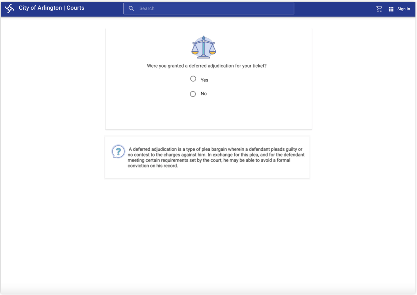
Though it was a goal to eliminate legalese, the content is often dynamically controlled by local jurisdictions
There was no quantitative data to help guide decisions about features
Research was qualitative and not tasked based, with the Product Owner driving the process
Joining the team as a consultant my history with the team and product is shallow
Design solution
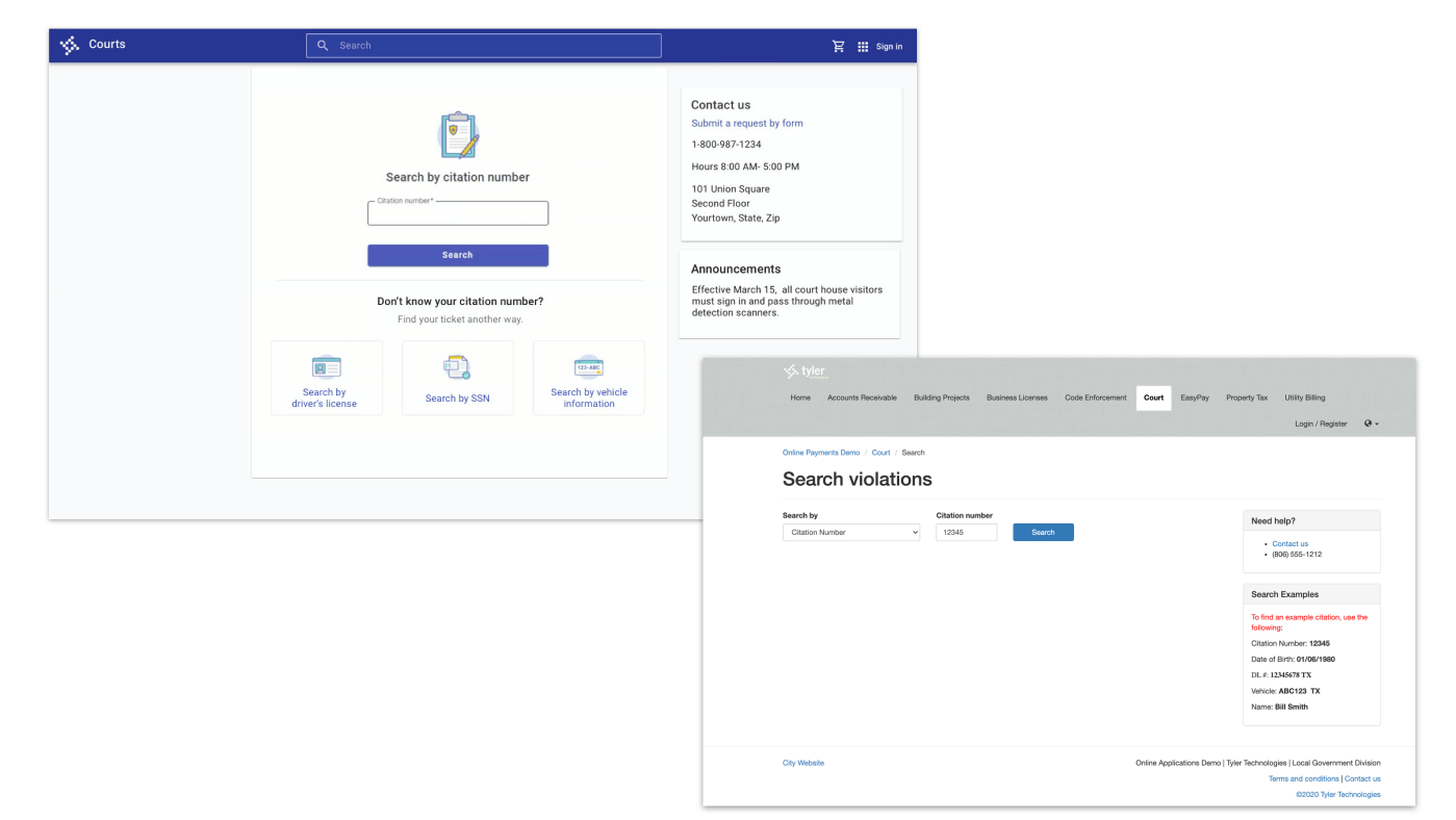
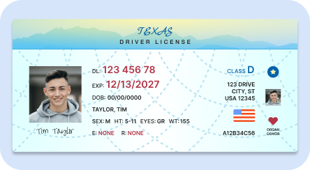
The design became more streamlined: the tabbed menu items now behind “app launcher” a standard navigation option in Tyler products. Popular drop down items now became responsive touch targets, clients can customize the number of search options . Usually 2- 3 options is the norm.
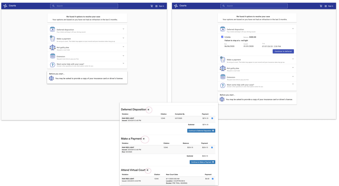
Here we present the citizen with different options to work through the process.
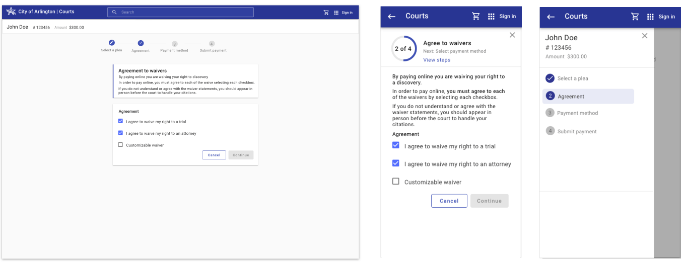
The design translated desktop features to mobile, such as a stepper.
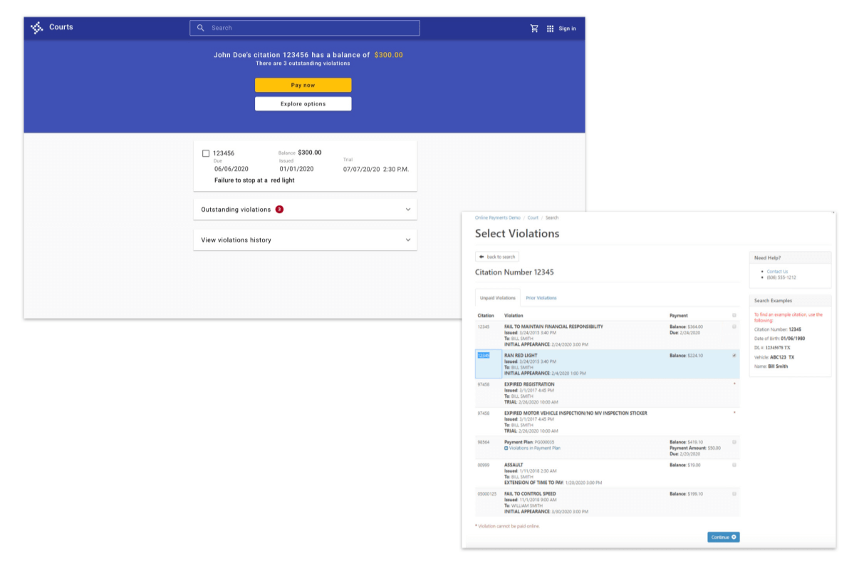
The new design separated current from previous offenses.
A direct citation search will present a focused return.
The wizard helps the user get through the flow.
Legacy application (L). Revised design (R).
Validate design with customers
Task based study-design validation
The team had a solid concept in place and we wanted to validate the design with customers before diving deeper into development.
The product owner served as the interviewer, and I as a notetaker.
We interviewed 4 court workers.
We used an interactive prototype done in Axure and a script gathering qualitative feedback.
What we learned
Results screen change hierarchy “Pay now” and “Options”
Results screen give balance on outstanding violations
Improve header across page to let people know they are on the right case
Keep language very simple
Outcome
The design was validated during our research and the product received positive feedback.
Online payments increased over 23% since rollout.
← Home
← Back Notary